Evaluation

In what ways does your media product use, develop or challenge forms and conventions of real media products?
My project as a whole both conforms yet challenges conventions of typical tv channels. In some ways it challenges them simply due to the type of programmes and music it would have on there. The sub-culture of tattoo's, rebellion, and alternative music and dressing in a non conventional way means that whatever is involved with that whether it's a radio station, a tv channel or a music video, it would push the boundaries of conventional media products and the interests of the majority of society. Because i took an 'alternative' styled approach to the project i learn a lot when it came to the obvious difference between music channel genres and also how few and far between punk rock channels there are. 
Though on the over hand, my products do conform to the stereotype of rock/alternative subcultured products, the colour scheme is dark and monochromic which is expected as the stereotype which is made daily is that "alternative people like the colour black". The brick wall i used as a background and subtle hints at vandalism show the generic anarchical view people think 'punks' have. The print advert for the ancillary projects, with the cat's open jaw as the image, plays on this rebellion too, a connotation of fierceness and passion. 
I think that following this conventions was necessary to gain interest and recognition from an audience, for example if my website looked like the colourful Viva website then people would assume my channel deals with the same music genre and social interest as those channels do and would then be confused when they see heavy metal music reviews, punk rock show videos and programs on tattooing when they go on the website. 

How effective is the combination of your main product and ancillary texts?
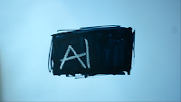
The combination of the 3 paged website, the animated ident, and the print advertisement is a good combination to have done. The website was the main project and i believe you can see this through the amount of thought and work done on the pages and the website is consistent throughout, sticking to the same themes, similar layouts and a consistent colour scheme which is all effective on its own. The print advert to go with that is something just to grab the audiences attention with the abstract look of it, in some ways the image in the background has nothing to do with the website apart from the logo thought beyond the superficial view and thinking about it more so the audience will realise it does have a relevance to the channel. The logo on the print advert makes it consistent with the website so it isn't too abstract and confusing for the audience, this is what makes is effective. Then choosing the animated ident rather than the two page spread made the project more interesting and let me be more creative and so i enjoyed a lot more which i think you can see through the finished products. The ident is stop motion which is rising in popularity at the moment in advertising as it is an easy and simple yet effective and intriguing way to grab the audiences attention. Making the ident by scribbling black marker pen and chalk on a piece of paper sounds amateur and scruffy though the rough around the edges look is what i was aiming to achieve throughout my whole project. The fact that what progressively appears throughout the ident looks like the 'ALT' channel logo ensures that the audience would recognise this as an ALT identity advert and so this is effective in the way it is recognisable.
The combination of a website, a print advertisement, and a animated ident makes my project diverse and interesting and exciting to look at. It's enabled me to learn a lot about new media technologies and the conventions of websites and music channels. Doing a website for my main project and doing an animated ident also shows diversity and a wider range of new media rather than if i was to do another combination, for example instead of doing the ident do the two page spread for a tv listings magazine. 

What have you learned from your audience feedback?
Here is a video of me talking about this: 


How did you use new media technologies in the construction and research, planning and evaluation stages?
The use of new media was most apparent and required as i chose new technology based projects to do, the website and the animated ident and even to make the print advert. Both the print advert and the website designing involved me using a very popular software, Adobe Photoshop. This allowed me to combine the image for my print advert with text, i could move the text around and seeing how each positioning of text worked without worrying about cost of printing and then not liking it and having to do it again which would have been apparent if i was not using new media technologies. I also used Adobe Photoshop to work on the website before actually making it a working website (html). Photoshop allowed me to create the rollovers, i.e to make the state of text and images when the mouse is hovered over them on the website before doing this on Adobe Dreamweaver. 
Adobe Dreamweaver was completely new to me as i had no knowledge on the software before this project, though after some research of my own on the internet and some teaching and help from college staff, Dreamweaver enabled me to put my 3 pages website up on the internet. I used Photoshop to slice everything, save for 'web and devices' then transfer onto Dreamweaver, slowly making my website. I done the same to make the rollovers, though my first ambitions were too high and expectations of what i could do were also too high and so i had to change my ideas. I made rollovers for some of the text on the menu bar, and linked the "music" tab and the "news" tab to page 2 and 3 i made on Photoshop. 
When i was constructing the ident i used Adobe iMovie, whish was another software i used in the project that i had no previous experience of knowledge with. Though unlike Dreamweaver which consisted of a confusing amount of coding and technique, iMovie was very simple and only required some common sense and being computer savvy. This software allowed me to bring video animation into my project which is a very popular form of advertising via new media. 
When doing the research i found that new media technology helped a lot, i was able to use the internet to find examples and information that i wouldn't have been able to find using old media technologies such as newspapers. With the internet i could use search engines to find a range of different music channel websites that were very similar and/or the same to my own channel, this helped me understand the codes and conventions of them and use some aspects for inspiration for my own ideas and designs. The internet also enabled me to use Youtube to find out about tv ident's and to explore stop motion animation a little more. Without these new media technologies my media research would have lacked greatly and i wouldn't have had an opportunity to get examples and develop conventions within my own project. It also would have meant i couldn' compare 'alternative' channels to mainstream ones such as Viva and wouldn't have had something to work against. 
When evaluation my work and getting feedback, the internet was useful to be able to compare my work, and also send it to friends who i do not see regularly. For example my friend whom has the same interests as me, and so fits into my target audience perfectly, is away at uni and his opinion was valuable considering he is studying music promotion and branding. I was able to email screen shots of my work to him and got his comments on the overall look of the project which helped greatly. 

Final Pieces and Feedback

The Finished Advert:


The Finished Ident:


The Finished Website Pages:


Feedback:
During my whole project i got feedback and opinions from my classmates, friends, and some of my family. My friends have the same interests as the target audience for the channel and so it was useful and helpful to get their opinion on the way things looked because if it didn't appeal to them then i was doing something wrong. Once i'd finished everything and was happy with the results and finished pieces i thought i'd put together a questionnaire and ask some people to fill it in, just to see if there was anything i could improve on. I gave out 25 copies of the questionnaire and on the questionnaire were screen shots of my website pages, the ident still pictures, and the print advert. This is what the questions were on the questionnaire:
1) Looking at the website pages what genre of music would you assume the tv channel plays and promotes? (Pop/Hip Hop/Dance/Rock).
2) Would you like to see more colour throughout the project? (Yes/No/Neither).
3) In your opinion, is the print advert a bit too "random", would it confuse you as to why there is a cats jaw on an advert for a music channel? (Yes it is too random/No, it is a bit random and abstract but works well).
4) Does the brick wall behind the text on the website pages make the text hard to read or comprehend? (Yes/No).
5) If you were to make any changes to the print advert what would they be?
6) Imagine the still images of the ident running as a video, do you think it is effective? (Yes/No/Kind of).
7) In the images of the ident can you read the text properly? (Yes/No).
8) Do you think all the different parts of the project compliment each other well? (Yes/No/In some parts).

I thought these 8 questions were enough to gain a good understanding of what people think of my products, and if they think they work well, look good, and achieve my aim. I gave some questionnaires to friends, some to people who study music tech at my college so they know and are involved with the type of thing my channel is about. The results are as follows:
1) 23 people said 'rock'. 1 person said 'pop'.
2) 4 people answered 'yes'. 17 people answered 'no'. 4 people answered 'neither'.
3) 3 people answered 'yes it is too random'. 22 people answered 'no, it is random but works well'.
4) 4 people answered 'yes'. 21 people answered 'no'.
5) This was an open question, a few people answered that they would make the colour scheme more colourful and bright and a few said they would change the logo and the background of the website. 19 people said they wouldn't change anything, which is a really good result.
6) 19 people answered 'yes'. 3 people answered 'no'. 3 people answered 'kind of'.
7) 22 people answered 'yes'. 3 people answered 'no'.
8) 18 people said 'yes'. 2 people said 'no'. 5 people answered 'in some parts'.

Looking at the answers as a whole, the results are very positive. The answers show that the majority of people wouldn't change anything and that the project is successful and effective overall. Because of these results from the questionnaire i'm not going to change anything to my work. The answers of the questionnaire have made me feel more satisfied with the end result of the project.

iMovie

To make the animated ident, i had to learn a little bit on how to work Adobe iMovie, which seemed quite confusing and bewildering at first though i quickly discovered how easy and simple it was to use. First of all i had to make a new project in the bottom left hand side of the screen by right clicking in the 'event library' section and creating a new event.


This was easy to do and so then once the new project was highighted in the side bar i dragged all my still images to the bottom section of the screen, one they had loaded i then dragged them into the top bit, as shown here:


Once they were all up the top i could then change the clip time, when i first dragged them into the top department the speed of how long it stayed on one shot was 3 seconds, which for one still image is a long time. To change this timing i had to click the settings icon in the corner of the screen and go from there:


On the 'Clip Adjustments' i changed the duration of the clip to 1 seconds, and made sure i ticked the 'apply to all stills' box. Though this was still too long and tedious, after trial and error and experimenting with different clip durations i settled for 0.2 seconds on all of the slides. This made it go quickly but not so quick that you couldn't see what was happening throughout the video, the timing was jsut right to b a short and effective ident.

I then added the video section of me drawing 'tv' on the paper to the project, i thought adding a video part would make the stop motion look a little less boing and normal, like everyone else's idea of stop motion. To do this i right clicked on the bottom section and chose 'import movie' and then done the same things as the still images, transferring it to the top section. I didn't edit or adjust this video clip.

I felt that the contrast and brightness was a bit dark and shaded in the pictures i took but didn't know if i could change this on Adobe iMovie, but after looking around near the transition editing part i found a setting box that changed the brightness and contrast:


All i done here was change the exposure to make the white background brighter so the black marker pen stood out of the page more.

I then thought that the ending of the video just ended too sharply and abruptly so i added a transition, i done this by clicking the transition icon in the middle bar on the right hand side of the screen as shown here:


After finding the edit that i wanted, a subtle 'fade to black' transition i simply dragged the specific transition icon to the end of the clip, and straight away it worked when i played my video the whole way through.

I done a similar thing to add the music to the clip, i right clicked in the upper project edit section and removed all the audio that was on my video and then found the music section which was right next to the transition icon:


There are a lot of sounds so i just quickly and briefly went through some of them until i found a few that i liked and thought suited my ident. I got feedback from my friends and class mates and the majority of them chose the 'delivery door truck' sound which everyone originally thought was a tattoo needle. I thought this was relevant to my target audience of the channel and so i stuck with this sound.

Advert Progress

When it came to thinking of a print advert for my channel i started to have a look at adverts that leading music channels have released in the past to gain an understanding of the codes and conventions of a music channel print advertisement.
My favourite out of the ones i looked at and the one i took as inspiration for my own are two MTV adverts:


The first advert is simplistic but effective with a minimal colour scheme which my tv channel website embraces anyway. The second advert with the bullet is extremely minimalistic and very abstract which has the confused effect on the audience. The bullet at first glance seems random and detached from the music channel, MTV though with more explanation from the small amount of text the audience learns it is a safe sex campaign, something which isn't associated with a music channel normally.
Both of the adverts have a small amount of text and rely heavily on the inquisitive nature of the audience when seeing the adverts. The first one strays from this slightly though as the image used is directly associated with a music channel. All of these points helped me to make decisions about my own print advertisement.


This is the first mock up print advert i done, using an image that wasn't my own just to get an idea of what would look good for my advert. Though after feedback from friends and classmates i decided against this design. The gig crowd as an image is stereotypical and just seems rather average for a music channel, in regards to the fact it is predictable and generic. I also came to realise it would look more professional and effective if my logo was on the advert, as people said it would add ownership and will enable the audience to recognise it. 
After thinking of ways i could make the advert a bit abstract i looks through my pictures folder on my laptop and found some images of my cat that i had recently taken on my new vintage film camera, one including a close up of my cat yawning and i instantly thought this would make a great image for my advert. 
This is what i came up with straight away, i altered the contrast and brightness on the original image just to make it stand out a little more and then added my logo. Originally when doing it i thought the small amount of white around the edge of the logo looked poorly executed and rough though feedback said that the logo looked like a sticker and so i took this as a good thing for the advert, playing on the idea of popular vandalism  where people stick logo's or sayings on walls and poles around city like places. 
On this final one i changed the alignment and position of the text on the top to make it look neater and plays on the convention of the eyeline in advertising, as the eye goes in a "Z" direction when looking at something and so this fits perfectly now. 

The Animated Ident

My original idea for my animated ident was to do a stop motion animation of me spray painting ALT on a brick wall, correlating directly to the brick wall on my website and the idea of rebellion that stereotypically comes with alternative/punk/rock music which is what my tv channel specifies with. Though when logically thinking about it this idea became less likely due to the fact i'd have to vandalise in order to get my desired result. I then tried doing the same sort of thing but on paper, and after trying different textiles i found that black marker pen on white paper and the white chalk with ALT tv over the top of he black pen had the effect of looking like my logo, which i thought would look really cool and relative.
I then started to take the pictures in order to make the stop motion animation, taking pictures after every small amount of drawing i done to make it look like it was slowly growing on the page when the stills were made into a video.


These are all the still images i used for my ident. I then filmed myself drawing TV beside the current text and added it onto the end of the stop animation. 
Then i had to add a piece of music, so i spent a while going through the sounds on iMovie, there was a few i liked; one of a busy city street, one of a crumpling paper sound, one of a thunder storm and one of a door opening on a delivery truck. Though after showing classmates and peers they all decided on the truck sound as the beginning sounds like a tattoo needle which goes very well with the genre of my tv channel. 
This is my finished ident for my tv channel: 

Ident Progress

Before starting this years media project i was none the wiser to what an ident was and so after some research of what it was and looking at some examples online of some idents for leading tv channels i thought it would be a fun project to take on and would let me be creative and learn something new.
On the BBC website they describe an ident as follows, 'Not really a testcard, but falling under the same umbrella, a television identification symbol, or 'ident', is the bit of video which tells you what channel you're on, played a few seconds before a programme commences.' 
This evening when watching television i have seen a few idents that were effective, different and quirky.
I then went on youtube to see if i could find any others, these are some that i really liked. 


This ident is by MTV and is very short but is enough to make the audiences attention focus.
This ident is for Channel 4, it is quite abstract but simple. 


This ident is for Kiss TV which is a dance music channel/radio channel. 

Ideas for my own ident include something very handmade and rough around the edges, i want to use stop motion as the form of animation we have to use and will do this on iMovie on an Apple Mac, adding the still images to a new project and editing it from there.

Website: Page 3/Manchester Orchestra

My first thoughts and ideas for my third page of my website involved a program about Essex students on a night out, very similar to the MTV program Jersey Shore which involves the same sort of thing just in a different place. Though seeing as we needed video and audio somewhere on our websites i thought i was a better idea to have a review about a band that i had recently bought tickets to see play in London. I thought the gig would be a perfect opportunity to film the band play and get some good pictures and use these on the third page.


After the progression i made on the Photobooth/second page of my website with the colour scheme, i decided to follow that through and keep the colour of the title font dark and plain but not black so it stands out from the rest of the text on the page. The layout of the page is fairly simple, with the article down the left hand side and a space for pictures and video on the left.


After putting on the pictures in a conventional way i thought it looked very boring and tedious, nothing really stood out so i then rearranged the pictures so they looked more interesting.


With the pictures in this screenshot positioned the way they are, i think it makes the whole page look a lot more lively. The space for the video underneath is just a guideline for when i transfer the file to Dreamweaver, as i can't upload the video onto Adobe Photoshop.